A photo browser is not just a place where thumbnails appear.
It is where you cull, compare, scan, review, keyword, and decide what deserves attention.
That means the layout matters.
A dense grid is useful when you need to scan hundreds of files quickly. A spacious layout is better when you are judging composition. Large thumbnails help with final review. Square cells make a clean contact sheet. Aspect-ratio-aware cells make the shape of the image visible before you open it.
The problem is that most browsers treat layout as one global preference.
MetaScope v1.4.0 changes that.
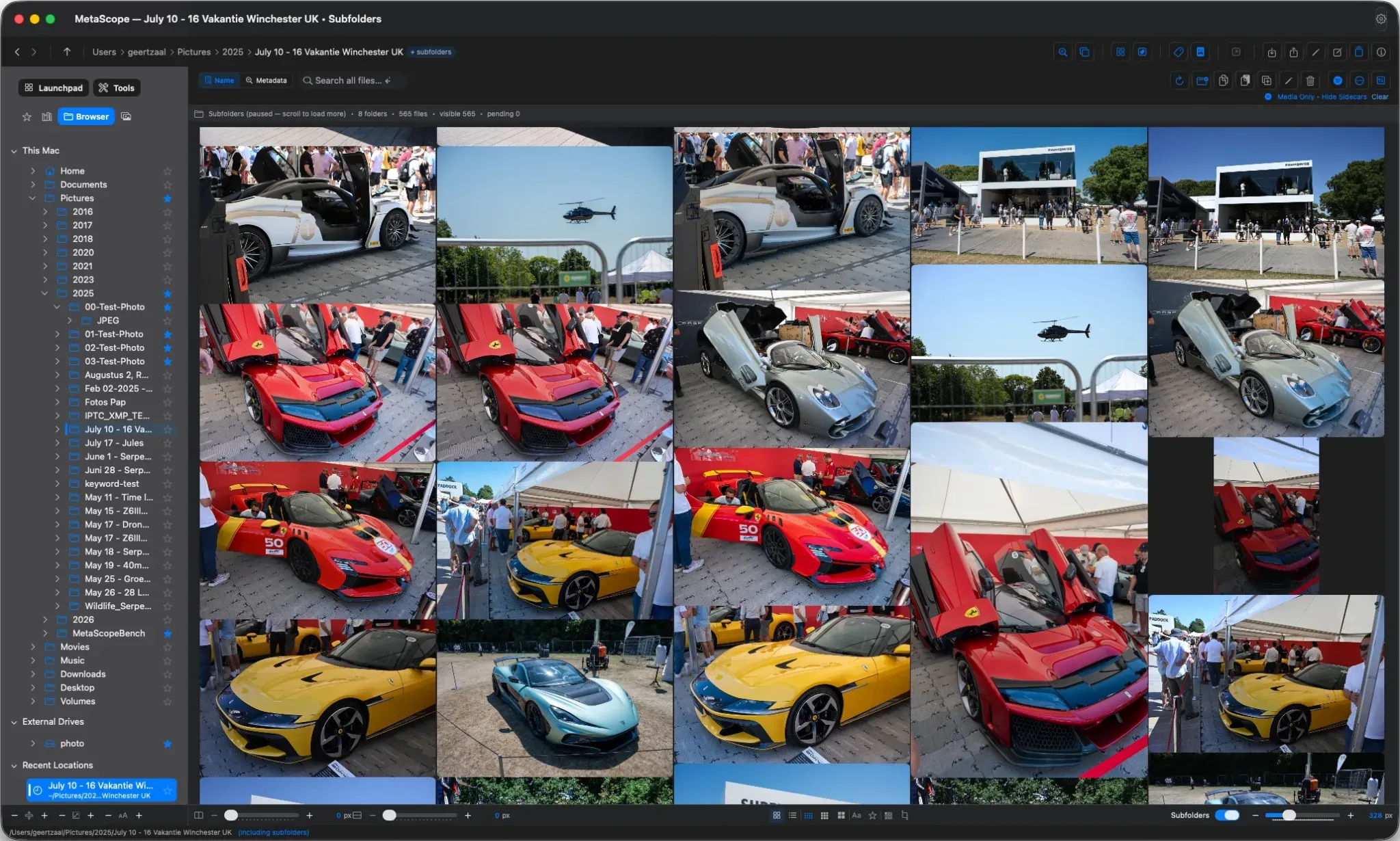
It adds a new Masonry layout, doubles the maximum thumbnail size, introduces footer controls across the browser, and makes display preferences work per window.
The result is simple: each window can now become the browser your current task needs.
Masonry: thumbnails that keep their shape
Traditional grids are tidy because every image is forced into the same cell shape.
That works for scanning, but it hides something photographers read instantly: aspect ratio.
A panorama, a vertical portrait, and a square crop can all look strangely equal when squeezed into uniform cells. You see the file, but not enough of the composition.
The new Masonry layout fixes that.
Masonry uses variable-height tiles that follow each image’s real aspect ratio. Wide images stay wide. Tall images stay tall. The grid flows into columns, giving you a more natural visual read of the library.
It is especially useful for culling and composition review because you can understand the shape of a frame before opening it.
Masonry works in both MetaScope browsers:
- the filesystem browser
- the Photos browser
So folders on disk and Apple Photos albums can now use the same visual treatment.
Three cell shapes, one control
MetaScope now supports three thumbnail cell shapes:
| Shape | Best for |
|---|---|
| Landscape | A balanced browsing view |
| Square | Dense scanning and contact-sheet style review |
| Masonry | Composition-aware browsing |
The cell-shape button in the footer cycles through:
Landscape → Square → Masonry
You can also set the default in:
Settings → Interface → Thumbnail Cell Shape
But in v1.4.0, that setting works differently than before.
Settings define the starting point for new windows. They do not force every open window to change.
That distinction matters because display is now per window.
Per-window display is the real shift
Masonry is the most visible new feature, but per-window display is the change you feel every day.
In v1.4.0, these display choices are stored independently per window:
- cell shape
- filename labels
- star-rating overlay
- provider badge
- horizontal spacing
- vertical spacing
That means two windows can show the same library in completely different ways.
You might keep a spacious Masonry view on your main display while using a compact Square grid on a second screen for reference. You might review a client folder with large thumbnails in one window while keeping a dense comparison set in another.
Changing one window no longer disrupts the others.
This makes MetaScope feel less like an app with one global display mode and more like a workspace where each surface can serve a different job.
Bigger thumbnails, sharper rendering
v1.4.0 also doubles the maximum thumbnail size from 512 px to 1024 px across the main places where thumbnail size matters:
- filesystem browser
- Photos browser
- Metadata Search window
- Compare Tray slider
Existing thumbnail-size preferences are preserved. You simply have more room to grow.
Rendering quality now scales with the size you are actually viewing and the pixel density of the screen. A large thumbnail on a Retina display gets a properly sharp image instead of an upscaled smaller preview.
For users who want even more detail, MetaScope adds a new setting:
Settings → Advanced → Thumbnail Quality
Available options are:
- 1024 px
- 1536 px
- 2048 px
The default is 1024 px.
This gives you control over the trade-off between thumbnail sharpness, performance, and library scale.
Footer controls where the work happens
Grid tuning should not require a trip to Settings.
v1.4.0 adds footer toolbars directly to the places where layout decisions happen.
The filesystem browser footer includes:
- horizontal spacing control
- vertical spacing control
- editable pixel fields
- minus and plus buttons
- Compact, Comfortable, and Spacious density presets
- filename toggle
- star-rating overlay toggle
- cell-shape control
- selection-style toggle
- thumbnail-size slider
The Photos browser gets its own footer controls, including a thumbnail-size slider and view-mode toggle.
The sidebar also gains a footer toolbar for row spacing, icon size, and font scale.
These controls make the browser easier to adjust in the moment. You can tighten the grid when scanning, open it up when reviewing, and change the visual density without leaving the window.
The footers are responsive too. As a window narrows, controls collapse progressively into popovers and overflow menus. The layout does not break all at once, and the key spacing controls stay reachable.
A selection style that stays out of the way
Selection is another small detail that affects how the browser feels.
Previously, selecting a thumbnail wrapped the whole cell in a border. That was clear, but visually heavy.
v1.4.0 introduces a new Compact selection style as the default.
Instead of outlining the full cell, Compact selection hugs the image itself with a subtle accent fill and a thin border. It remains visible without overwhelming the grid.
The older full-cell border remains available as Classic.
You can switch between them in:
Settings → Interface → Selection Style
Or directly from the browser footer.
Different tasks need different grids
The larger point is that image review is not one activity.
Culling wants speed.
Composition review wants shape.
Keywording wants enough density to compare related files.
Final review wants large, sharp thumbnails.
Reference browsing wants a stable layout that does not change when another window changes.
v1.4.0 lets those needs coexist.
One window can use Masonry to judge composition.
Another can use Square to scan a thousand files.
A third can use larger thumbnails for final review.
Each window keeps its own display choices.
That is what makes this release feel different. It is not just more layout options. It is layout becoming contextual.
Why this matters
A browser is something you spend a lot of time looking at.
When it fights the task, you feel it constantly. When it adapts to the task, it almost disappears.
MetaScope v1.4.0 makes the browser more flexible without making it more complicated. Masonry gives images their shape back. Larger thumbnails make review more useful. Footer controls put layout tuning where your hands already are. Per-window display lets each window serve a different purpose.
It is the same library.
It just no longer has to look the same everywhere.
The rest of v1.4.0 carries the same idea into where you start your work and how you manage keywords, covered in Two Better Ways to Start Your Work and the Keyword Workbench.
MetaScope v1.4.0 is available now. Masonry layout, larger thumbnails, per-window display preferences, footer toolbars, and the new selection style are part of the core app.